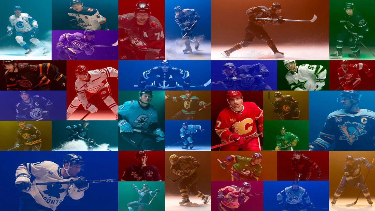
The NHL finally unveiled all 32 Hometown Remix uniforms Monday after months of leaks and speculation. Below, we rank them from worst to best.
32. Edmonton Oilers

These are just a more drab version of the all-navy uniforms the Oilers ditched a few years ago. Did they think this was a Halloween assignment?
31. Montreal Canadiens

Thank goodness the Habs' Heritage Classic jerseys rocked, because this All-Star Game-esque look does not.
30. Vancouver Canucks

These are the same color as the bottom of the sea, where they belong.
29. Dallas Stars

The Stars' insistence on using neon green has yet to produce a jersey that will stand the test of time.
28. Colorado Avalanche

We genuinely don't know what the Avalanche were going for here. Apparently it's supposed to represent snow-covered mountains? Hopefully their Winter Classic fits are more inspired.
27. Los Angeles Kings

The black accents make this significantly worse than the Kings' previous attempts to incorporate purple, which have mostly been quite nice.
26. Detroit Red Wings

The Red Wings' regular jerseys are nearly perfect. These are just a worse version.
25. St. Louis Blues

This is just a Tampa Bay Lightning rip-off.
24. Tampa Bay Lightning

This is just a St. Louis Blues rip-off.
23. Pittsburgh Penguins

The Penguins are back in blue for the first time in years, but these don't have the same appeal. There's a lot going on here.
22. Minnesota Wild

These will probably look great in action, but they're oddly similar to Dallas' original look after the North Stars relocated to Texas.
21. Winnipeg Jets

Taking inspiration from the northern lights is a cool idea, but the Jets could have leaned into it more.
20. Seattle Kraken

Using the same color as the Kraken's primary home jerseys makes these a letdown.
19. Utah Mammoth

The Mammoth introducing their first blue jersey is predictable, and using their alternate logo as a primary crest is pretty uninspiring.
18. Chicago Blackhawks

Green could have been a fun idea, but slapping it over Chicago's regular design makes these look like a St. Patrick's Day warmup kit instead of a unique remix.
17. Philadelphia Flyers

Not much stands out about these other than the sheer volume of stripes. The definition of "meh."
16. Florida Panthers

While this jersey does represent South Florida vibes, it isn't as appealing as the baby blue Reverse Retro the Panthers sported a few years ago.
15. New Jersey Devils

This suits the franchise and will look solid on the ice, but it's just the 2024 Stadium Series jersey inverted ... and worse.
14. New York Rangers

The details are nice, but the Rangers wore almost this exact jersey as an alternate for years. Give us something fresh.
13. New York Islanders

Doesn't this jersey already exist? At least it looks sharp.
12. Columbus Blue Jackets

It's difficult to make gray work as a base color, but the Blue Jackets will look slick in these. The cannon logo works perfectly with this scheme.
11. Vegas Golden Knights

These definitely scream "Las Vegas." These would be ranked higher if the roulette board design appeared along the bottom stripe as well.
10. Toronto Maple Leafs

This color scheme exudes an Original Six feeling and should look great on the ice. However, the Maple Leafs lose points for placing their wordmark below their logo and the bright white on the arm stripes and collar, which doesn't match the base off-white color.
9. Washington Capitals

Seeing Alex Ovechkin in vintage Capitals colors for his final season is going to rule.
8. Nashville Predators

The Predators' break from all yellow is welcome - they've strayed from navy for too long. This uniform has more distinctive details than most from the Hometown Remix project, too.
7. Boston Bruins

Brown jerseys presented the perfect opportunity for a bear logo, but that doesn't necessarily fit the Bruins' "college" vision for their latest threads. It's a solid effort anyway.
6. Ottawa Senators

Ottawa used just the right amount of gold to make these uniforms pop.
5. Calgary Flames

The gold works quite nicely with red, and the Saddledome striping at the bottom is a great touch to recognize the iconic rink's final year.
4. San Jose Sharks

The shoulder-patch logo as a primary crest is a little much, but the shark-inspired sleeves are the perfect level of tacky for a memorable jersey.
3. Carolina Hurricanes

Stormy the Ice Hog is doing some heavy lifting here, but he succeeds in bringing life to a Hurricanes franchise that's been sporting boring uniforms for too long.
2. Buffalo Sabres

This is a great blend of the Sabres' two identities. Long live the "Goathead."
1. Anaheim Ducks

These beauties will strike a nostalgic chord for a whole generation of hockey fans who grew up with Charlie Conway and the District 5 Mighty Ducks.